

Flutter Declutter : Using inputDecorationTheme
Episode 1 of an ongoing series to make flutter code more beautiful !


Table of contents
This article is adopted from the following video
So, if you believe that watching/listening is more beneficial than reading ! that video should cover all the same content .
Also , you can find the full code for this tutorial on Github here
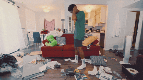
The Clutter
Building a form is a common task in almost any mobile application, those forms often contain TextFields or TextFormFields that most of the times will have the same decoration and style. Hence, you'll need to define decoration property for each field and that will result in lots of redundant code and lots of copy/paste operations, and as y'all know as long as you're copying and pasting .. you're doing something wrong.
Here's an example form
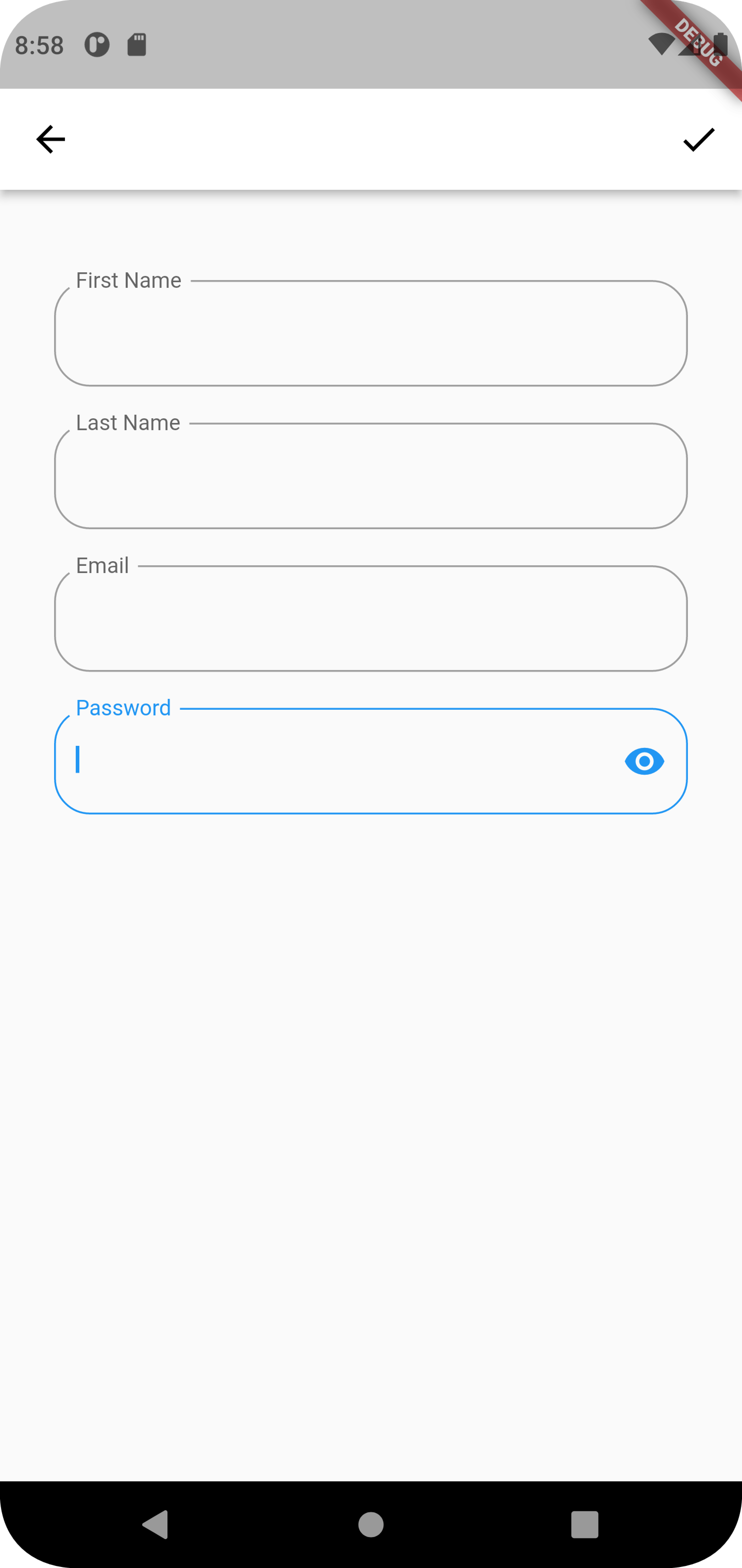
And below is the code for a form with just 2 TextFormFields
import 'package:flutter/material.dart';

class ClutteredForm extends StatelessWidget {
  const ClutteredForm({Key? key}) : super(key: key);

  @override
  Widget build(BuildContext context) {
    return Scaffold(
      appBar: AppBar(
        backgroundColor: Colors.white,
        leading: BackButton(
          color: Colors.black,
        ),
        actions: [
          IconButton(
              onPressed: () {}, icon: Icon(Icons.check, color: Colors.black))
        ],
      ),
      body: Padding(
        padding: const EdgeInsets.all(20.0),
        child: Column(
          children: [
            SizedBox(
              height: 20,
            ),
            TextFormField(
              decoration: InputDecoration(
                label: Text("First Name"),
                // by making this property tru , the label of the TextFormField will
                //ALWAYS float to the top of the field with a nice animation
                floatingLabelBehavior: FloatingLabelBehavior.always,
                // specify the shape and color of the border of the TextFormField
                disabledBorder: OutlineInputBorder(
                  borderRadius: BorderRadius.circular(20),
                  borderSide: BorderSide(
                    color: Colors.blueGrey,
                    width: 1,
                  ),
                ),
                enabledBorder: OutlineInputBorder(
                  borderRadius: BorderRadius.circular(20),
                  borderSide: BorderSide(
                    color: Colors.grey,
                    width: 1,
                  ),
                ),
                focusedBorder: OutlineInputBorder(
                  borderRadius: BorderRadius.circular(20),
                  borderSide: BorderSide(
                    color: Colors.blue,
                    width: 1,
                  ),
                ),
                errorBorder: OutlineInputBorder(
                  borderRadius: BorderRadius.circular(20),
                  borderSide: BorderSide(
                    color: Colors.redAccent,
                    width: 1,
                  ),
                ),
                focusedErrorBorder: OutlineInputBorder(
                  borderRadius: BorderRadius.circular(20),
                  borderSide: BorderSide(
                    color: Colors.orangeAccent,
                    width: 1,
                  ),
                ),
                errorStyle: TextStyle(
                  color: Colors.red,
                  fontSize: 16,
                ),
              ),
            ),
            SizedBox(
              height: 20,
            ),
            TextFormField(
              decoration: InputDecoration(
                label: Text("Last Name"),
                // by making this property tru , the label of the TextFormField will
                //ALWAYS float to the top of the field with a nice animation
                floatingLabelBehavior: FloatingLabelBehavior.always,
                // specify the shape and color of the border of the TextFormField
                disabledBorder: OutlineInputBorder(
                  borderRadius: BorderRadius.circular(20),
                  borderSide: BorderSide(
                    color: Colors.blueGrey,
                    width: 1,
                  ),
                ),
                enabledBorder: OutlineInputBorder(
                  borderRadius: BorderRadius.circular(20),
                  borderSide: BorderSide(
                    color: Colors.grey,
                    width: 1,
                  ),
                ),
                focusedBorder: OutlineInputBorder(
                  borderRadius: BorderRadius.circular(20),
                  borderSide: BorderSide(
                    color: Colors.blue,
                    width: 1,
                  ),
                ),
                errorBorder: OutlineInputBorder(
                  borderRadius: BorderRadius.circular(20),
                  borderSide: BorderSide(
                    color: Colors.redAccent,
                    width: 1,
                  ),
                ),
                focusedErrorBorder: OutlineInputBorder(
                  borderRadius: BorderRadius.circular(20),
                  borderSide: BorderSide(
                    color: Colors.orangeAccent,
                    width: 1,
                  ),
                ),
                errorStyle: TextStyle(
                  color: Colors.redAccent,
                  fontSize: 16,
                ),
              ),
            ),
          ],
        ),
      ),
    );
  }
}
it's a mess, right?
suppose you have more than 2 fields, say 5, or maybe more! it'll be a nightmare!
so, how do you declutter this mess? Enter inputDecorationTheme
InputDecorationTheme class
Defines the default appearance of InputDecorators.
This class is used to define the value of ThemeData.inputDecorationTheme. The InputDecorator, TextField, and TextFormField widgets use the current input decoration theme to initialize null InputDecoration properties.
if you don't know about theming in flutter , checkout this amazing talk from Flutter Interact '19 by Yasmine Evjen
Decluttering Steps
Step #1
Create a file theme.dart with the following code in it
import 'package:flutter/material.dart';

class MyInputDecorationTheme {
  // A method that returns InputDecorationTheme to pass it to the inputDecorationTheme
  // property of the ThemeData Class  in main.dart
  InputDecorationTheme myInputDecorationTheme() => InputDecorationTheme(
        // by making this property tru , the label of the TextFormField will
        //ALWAYS float to the top of the field with a nice animation
        floatingLabelBehavior: FloatingLabelBehavior.always,
        // specify the shape and color of the border of the TextFormField
        disabledBorder: _buildOutlineInputBorder(Colors.blueGrey),
        enabledBorder: _buildOutlineInputBorder(Colors.grey),
        focusedBorder: _buildOutlineInputBorder(Colors.blue),
        errorBorder: _buildOutlineInputBorder(Colors.red),
        focusedErrorBorder: _buildOutlineInputBorder(Colors.orangeAccent),
        errorStyle: _buildTextStyle(Colors.red),
      );

  OutlineInputBorder _buildOutlineInputBorder(Color color) =>
      OutlineInputBorder(
        borderRadius: BorderRadius.circular(20),
        borderSide: BorderSide(
          color: color,
          width: 1,
        ),
      );

  TextStyle _buildTextStyle(Color color, {double fontSize = 16}) => TextStyle(
        color: color,
        fontSize: fontSize,
      );
}
inputDecorationTheme has a plethora of properties, consult the documentation to learn more about the purpose of each property.
Step #2
Define the theme property in MaterialApp widget :
    return MaterialApp(
      title: 'Declutter Flutter : Episode 1 ',
      theme: ThemeData(
        inputDecorationTheme: MyInputDecorationTheme().myInputDecorationTheme(),
      ),
      home: DeclutteredForm(),
    );
Now, all of your TextFields or TextFormFields will look exactly the same.
That's it for today's episode, I hope you found it helpful.
You can find the full code for this tutorial on Github here